


The Essential Digital Marketing Trends to Watch in 2025
By Emily SmithDec 13
What skills and tools do marketers need to stand out in 2025? We surveyed 1,300+ marketers to find out.
Published December 3rd 2010
In this instalment of the Brandwatch tutorials, we are going to look a bit more into where buzz is coming from. More precisely, let’s see which websites are sources of buzz for your query. This matters as it will help you understand your query’s “community”, and can tell you which sites to focus on for marketing and engagement (more about these in later sessions).
A quick overview
First, let’s load your saved workspace about the Superdry query. Refer to the previous tutorials if needed. Then go to the first tab of that workspace, and look at the Summary component. As always, that component is a very good way to get a quick overview of the buzz around a query.

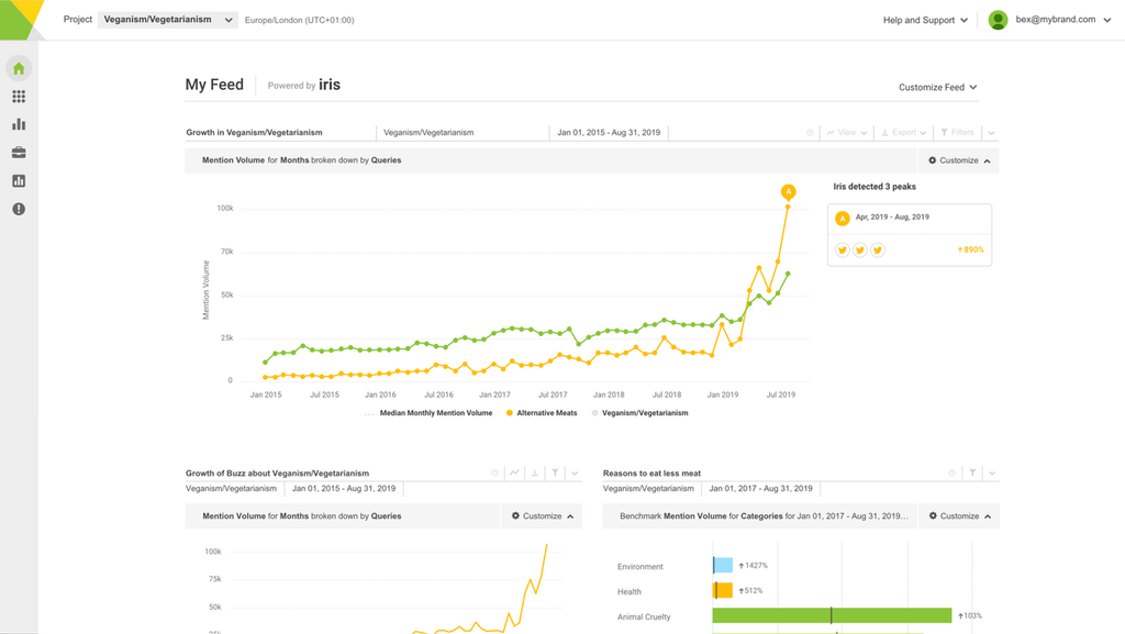
Sites information in the Summary component
Under the ‘Where from’ heading you should notice a bar chart showing the type of websites where Superdry mentions come from. In the screenshot above, we can see that most of the mentions come from Twitter, but quite a few also come from blogs and forums. These are all key components of social media. Note that you can hover your mouse on each bar in the chart, to see the actual number of mentions. You can also click on the bars to see the individual mentions within that type of website.
Next to this, under the ‘Which sites’ heading, you should see a list of the top 10 precise sites with the most mentions. In the above screenshot, Twitter comes first again, but we can see that Yahoo Answers and Facebook come second and third. Here too you can see individual mentions by clicking on the site names.
In more details
To find our more about which sites mention Superdry, click on the third tab, labelled ‘Sites & Recurring Phrases’. There you will see the Site Analysis component (labelled ‘Top sites’). That component is also a list of the sites which mention your query most, but it provides much more details about the sites.

Site Analysis component
For each site, the component shows:
By default the component shows the top 20 sites, but you can change this by clicking on its Controls button, then on ‘Filter options’, and right at the bottom change the number from 20 to say 100, and click on Load data. Note that you can sort the table in different ways by clicking on the column headers – but this only sorts the 20 or 100 sites that have been loaded.
You can change the component’s view to show either a bar chart or a pie chart. These charts can be copy/pasted in a report, as explained in the second tutorial. You can also click on the XLS button to download the component’s data in an Excel spreadsheet. This is useful if you want to make your own graphs or need to include the numbers in a report.
That is all for this fourth tutorial! Once again, do Contact Us if you have any questions.
Consumer Research gives you access to deep consumer insights from 100 million online sources and over 1.4 trillion posts.
Existing customer?Log in to access your existing Falcon products and data via the login menu on the top right of the page.New customer?You'll find the former Falcon products under 'Social Media Management' if you go to 'Our Suite' in the navigation.
Brandwatch acquired Paladin in March 2022. It's now called Influence, which is part of Brandwatch's Social Media Management solution.Want to access your Paladin account?Use the login menu at the top right corner.